Faces of Design: The Collaboration Between Designer & Painting Pro
Welcome to the second annual Faces of Design, a partnership with Luxe Interiors + Design and Benjamin Moore. The 2023 class is comprised of 21 interior designers and professional painters who work side-by-side to bring the transformative power of paint and color to life for their clients.
Charlotte, NC
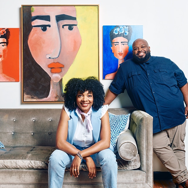
Marie Cloud + John Parker
Every professional in the design field possesses a guiding philosophy or two. In the case of designer Marie Cloud and paint contractor John Parker, one such overarching ethos serves as bonding glue: client is king. “All of my homes are unique,” Marie shares. “I’ll never repeat myself, because each space is true to the homeowner’s heart, soul and personal story.” Likewise, John chimes in, “We are committed to transforming living environments to reflect the homeowner’s unique personality.” Paint, of course, is central to their methods in doing so. Marie enthuses on its role in design: “Paint is like language. It can transform interior and exterior environments, changing the overall ambience and mood. Lighter shades, such as beige and cream, create an airy, open feel, while darker shades, like navy blue or emerald green, lend a cozy and intimate atmosphere. It can also help to disguise imperfections and enhance architectural features, such as crown molding and baseboards. Paint is like magic.” Especially when it is applied with skill. As John puts it, “Top-notch workmanship ensures a beautiful result.”
Learn more about Marie Cloud and John Parker.
“I love Classic Burgundy HC-182 for its luxurious and indulgent essence. It is the velvet of colors; I can feel it.”
— Marie Cloud

Philadelphia, PA
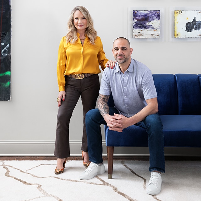
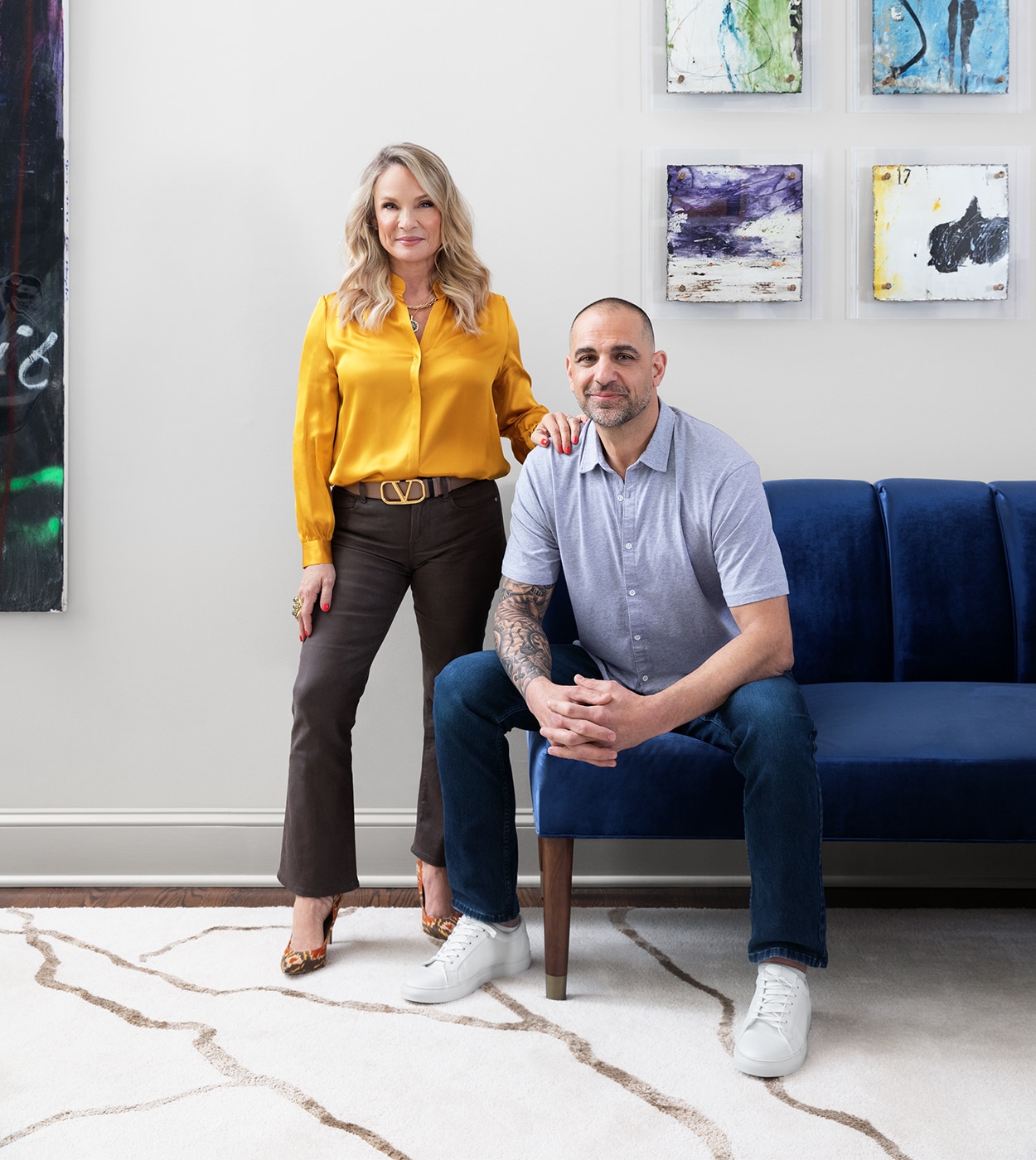
Michele Plachter + James Cervone
Describe the impact paint has on your projects.
Michele: Color is the cornerstone of all great design, whether we’re using it to bring the outdoors inside, to create a cozy man cave with dark and moody tones, or to add a soft touch to a bedroom with a gentle palette. We love to play with unexpected color and finish choices as well. When we have clients who are open to it, we get experimental!
How did you come to work together?
Michele: James and I were introduced by our mutual contractor. The painter I used for 20 years had retired, so I was looking for another talented painter. Mission accomplished!
What are some of your go-to paint products?
James: For walls, I would say the Aura® Interior Matte is above all other products I’ve used, and for trim, the Advance® Interior Satin product is definitely our favorite!
Learn more about Michele Plachter and James Cervone.
Color is the cornerstone of all great design.
— Michele Plachter
New York, NY
Kati Curtis + Jose Oceguera
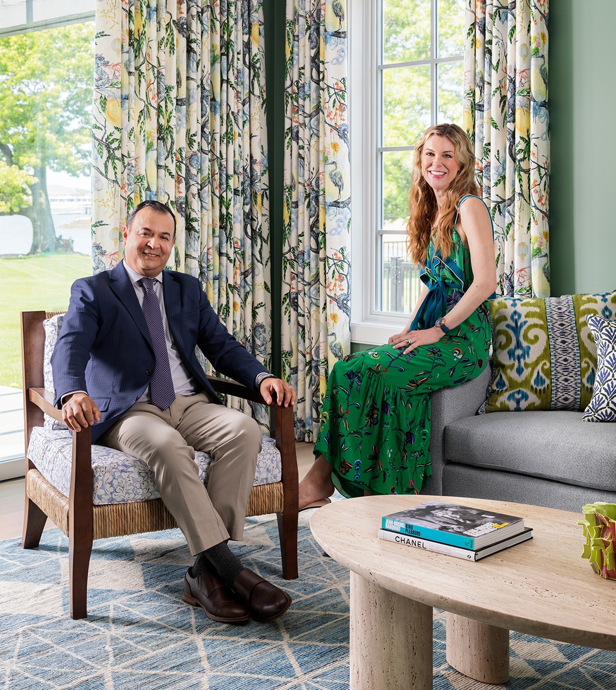
Often, the reason two colleagues become long-term partners comes down to one simple factor: they just “get” each other. Take it from designer Kati Curtis, who has been working with painting contractor Jose Oceguera for years. “Jose has an intuitive understanding of my design preferences and requirements, which means I don’t need to provide excessive direction,” she says. Together, they thrive on great feats of design and execution, including one project where color changes were desired at the last minute. “Within a week, we transformed the home, and the furnishings were protected throughout,” Jose shares. “We take pride in our work and strive for excellence, ensuring that everything is done right the first time.” As for the paint-related advice they share with homeowners, Kati points to the challenge of selection. “I strongly caution against relying on paint chips alone, because even larger squares can be misleading—the eye tends to perceive colors as darker against a white background. We love Benjamin Moore’s online tool, where you can upload a photo of the room and see any color applied to it.”
Learn more about Kati Curtis, and
reach Jose Oceguera at 914-760-4435.
“The idea that dark colors make spaces seem smaller is a common misperception. They actually expand the space.”
— Kati Curtis


Nashville, TN
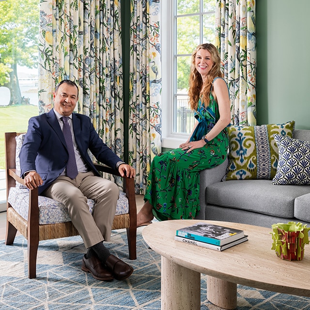
Matt Donahoe + Erwin Herceg
For many trade partners, the working relationship begins with a personal passion project. This was the case for Matt Donahoe and Erwin Herceg.
About 12 years ago, Matt and his husband hired Erwin to assist with a renovation in their own home. The scope was daunting, but Erwin’s work was masterfully executed. “We have collaborated together ever since,” Matt says. “When we show up on a jobsite together, the contractors sweat.” Why? Because the duo has a fervor for outstanding quality. The results usually feature Benjamin Moore products. “I like Scuff-X® for high-traffic areas and Aura® Bath & Spa when moisture is a factor,” Erwin shares. “Also, I always use Benjamin Moore® ceiling paint.”
Learn more about Matt Donahoe and Erwin Herceg.
“Our designs hinge on materiality and execution. We are specifying artisan-level finish work, and as such, we must have a close, trusted bond.”
— Matt Donahue
Matt Donahoe and Erwin Herceg's favorite colors, respectively.


Dallas, TX
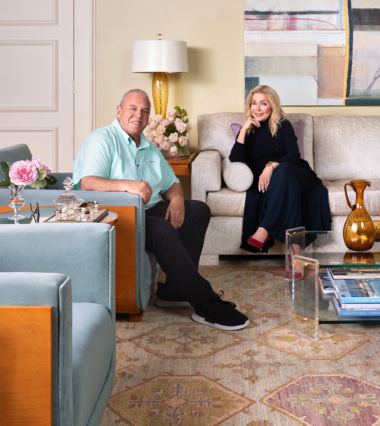
Jan Showers + Louis Gloria
How did you come to work together?
Jan: I saw the quality of craftsmanship Louis possessed and was so impressed. The work he did on our room at the first Kips Bay Decorator Show House Dallas was masterful, and we received more comments about it than anything else. We have been collaborating for the five years since!
Why is the connection between designer and painting contractor key to a project’s success?
Louis: When these two parties communicate well and have a “feel” for each other’s skills and talents, the result will fit the homeowner’s desires, personality and character like a glove.
Also, being able to troubleshoot through the confusion of any unexpected issue is something that is strengthened with years of experience working together.
Share a pro tip for choosing the right paint color.
Jan: In rooms with low ceilings, I like to paint the ceilings, moldings and walls all the same color. It causes the room to look larger and taller.
Learn more about Jan Showers and Louis Gloria.
“Advance® Satin gives you the feel of a classic, timeless oil finish without the disadvantage of rapid yellowing.”
— Louis Gloria
Jan Showers' favorite colors.


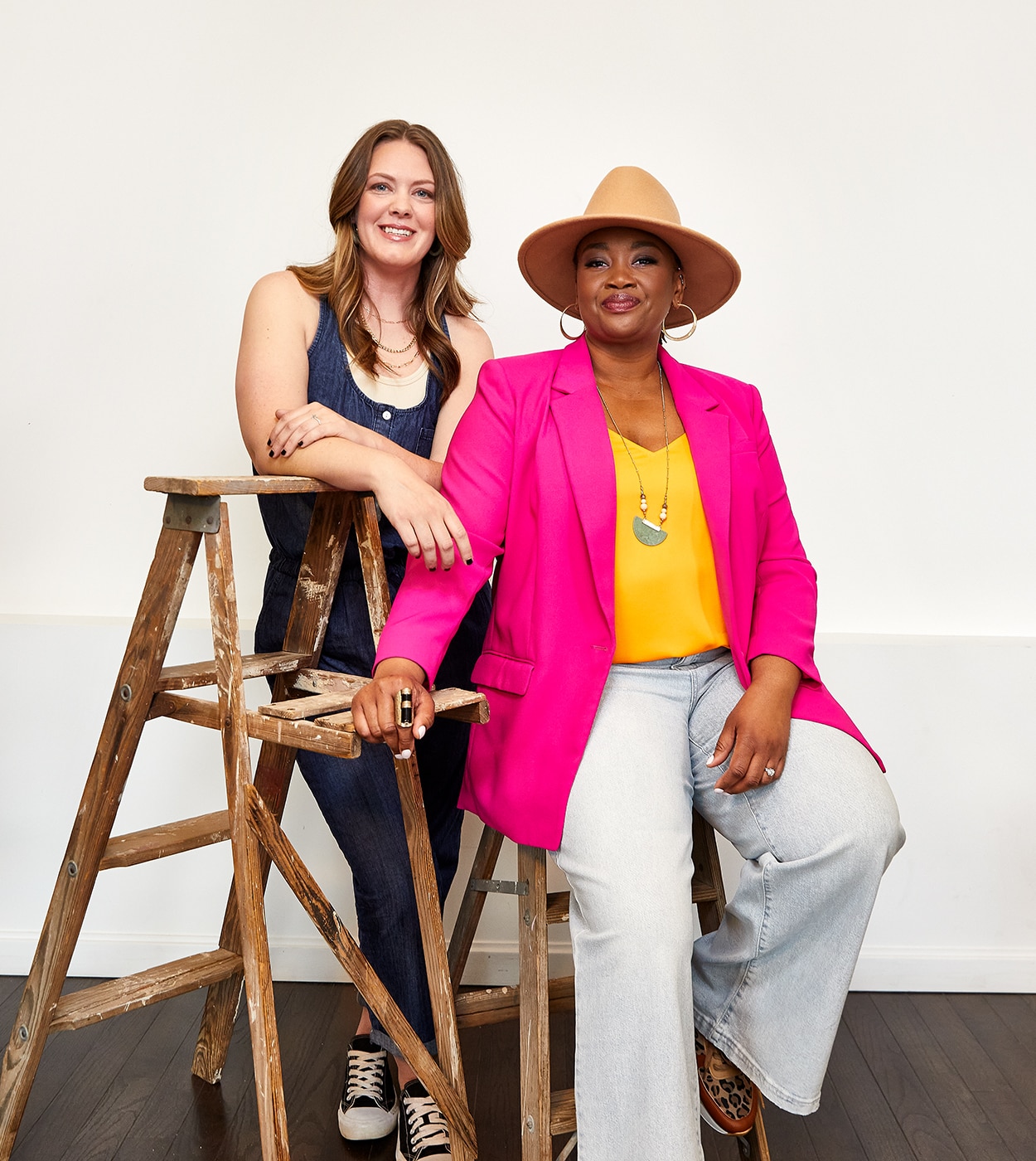
Cincinnati, OH
O. Stephanie Beverly + Jessica Galloway
Why is the connection between designer and painting contractor key to a project’s success?
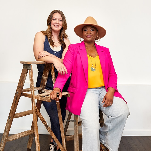
Stephanie: I think of the designer-painter relationship much like a musician and the conductor.
Both are essential to a beautiful and cohesive sound—and space, in the context of design.
What are some of your go-to paint products?
Jessica: Benjamin Moore’s Scuff-X® is the bee’s knees! The leveling capability of this product is superb. The satin finish is true satin and doesn’t lose sheen with spray application. Newer to my toolbox is Command®. We refinish staircases often, and for stair treads, I stand by this product.
Which colors inspire you the most?
Stephanie: Hands down, the most inspirational colors are deep, moody ones that evoke a feeling like a loving embrace or a nod to creativity: blacks, deep blues, purples, deep oranges and deep, golden yellows.
Learn more about O. Stephanie Beverly and Jessica Galloway.
“Consideration of how I want a space to look in relation to shifting light is crucial. I love that Benjamin Moore’s paints are multifaceted in that way.”
— O. Stephanie Beverly
O. Stephanie Beverly and Jessica Galloway’s favorite colors, respectively.


Chicago, IL
Sarah Vaile + Jim Berardi and Mike Foley
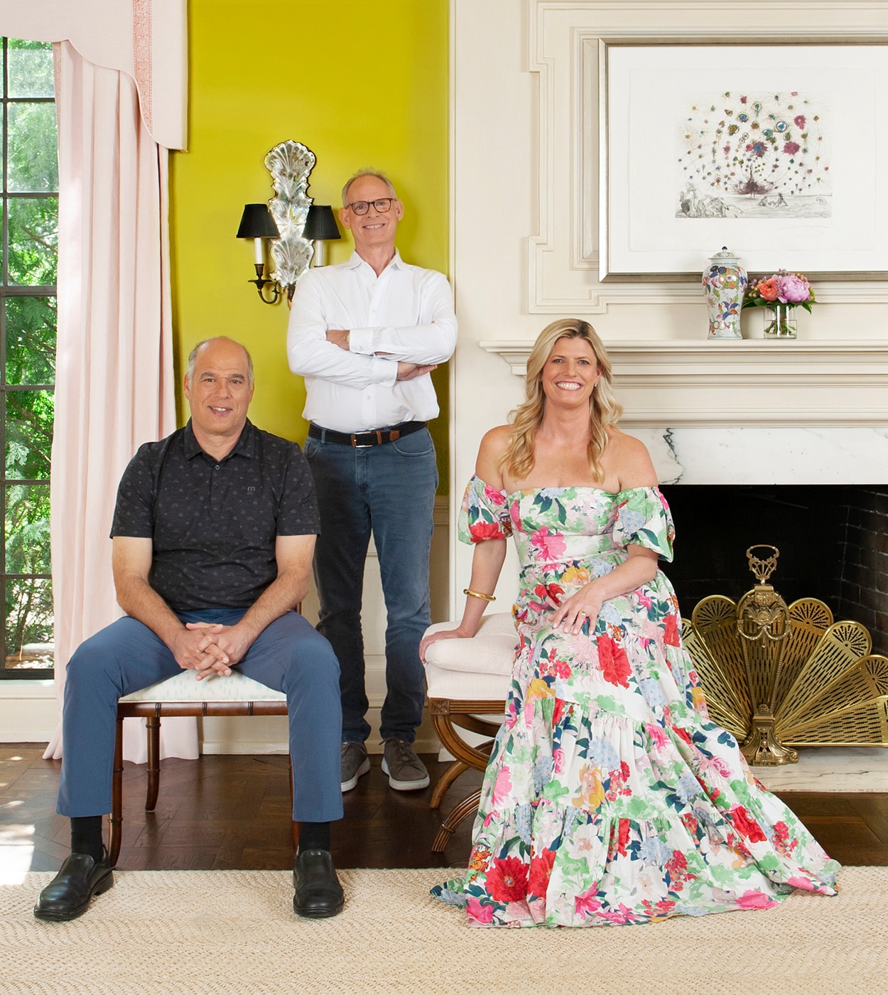
When a designer has a reputation for color, it’s a safe bet they’ll have a close relationship with a painting pro. Case in point: Sarah Vaile, Jim Berardi and Mike Foley (center). She’s known for her use of bold hues, and they are the application pros who make it happen. “Paint is the most underestimated challenge of interior design,” Sarah shares. “It is the canvas.” Jim and Mike play to its importance, with a knack for selecting the ideal formula and sheen, and then executing it to perfection—and to the client’s delight. “We collectively seek discerning clients who can appreciate the impact of fine prep and nice brushwork,” Mike says. “There are many factors we consider along the way, from a family’s lifestyle to window exposure and beyond.”
Learn more about Sarah Vaile and Jim Berardi & Mike Foley.
“I love mixing sheens in an unexpected fashion, such as high gloss sprayed onto the crown molding and paneling, with matte on the walls.”
— Sarah Vaile

Los Angeles, CA + New York, NY
Peti Lau + John Fasano
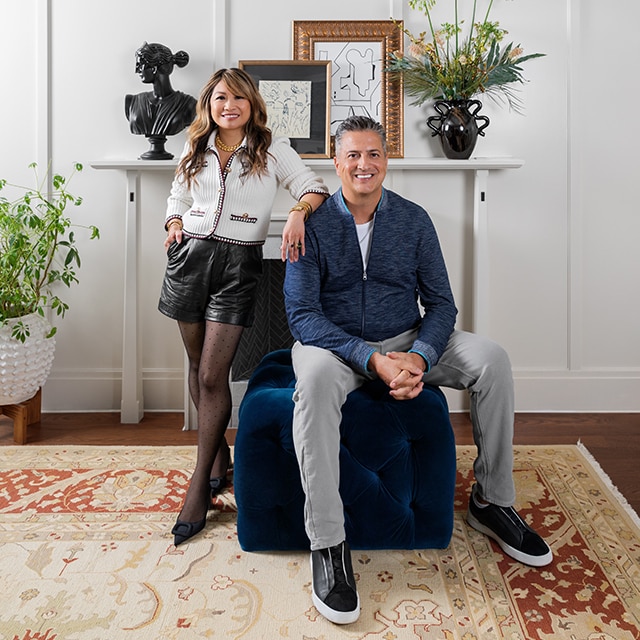
The order of the day may be paint, but Peti Lau and John Fasano first met due to the installation of wallpaper. After collaborating to install it for a Housing Works Design on a Dime charity event in 2016, the duo began a partnership that would culminate in countless perfected paint jobs. As Peti says, “It takes two to tango!” Asked to share their old-faithful approaches to the process, one talks color and the other formula. “I tend to go with saturated hues of blues, dark greens, teals and wine colors when I want drama,” Peti says.
“When neutrals are the call, I like warm tones like taupes, greiges and sage colors.” John chimes in, “The specific features of Aura® give the premium application we’re seeking, but my favorite combo is White Dove OC-17 in Advance® Satin. It holds color and gives a durable, high-end finish.” With Peti’s design eye and John’s technical expertise and unparalleled prep work, they make an ideal team for each perceptive client. “I love that I get to help transform lives by giving my clients the ability to create their unique home,” Peti says. “That begins, of course, with paint.”
Learn more about Peti Lau and John Fasano.
“I love Benjamin Moore’s Advance® Satin. I think it’s the best paint on the market.”
— John Fasano
Peti Lau’s favorite colors.


Vancouver, BC
Jamie Deck + Ference Schold
Why is your collaborative relationship critical to a project’s success?
When one holds to the “less is more” philosophy, there is a certain demand on the foundation of a space: there must be incomparable quality. As a designer known for her minimalist, Japanese and Nordic-inspired spaces, Jamie Deck would know. For her, the clean slate of simplicity begins with paint—and expert Ference Schold. “In this artistic collaboration, both the interior designer and the painting contractor play integral roles, each contributing their unique skills and expertise to the vision,” Jamie says. “Ference meticulously prepares surfaces, addressing imperfections.” Being that Jamie and her clients gravitate toward crisp, tranquil whites and creams, a smooth application is a necessity. The secret, Ference emphasizes, lies in formulation. “Paint products that offer ease of application without splattering or sagging are imperative to that flawless finish,” he says. “I prioritize those that have good viscosity control, reducing the likelihood of drips or visible brush and roller marks. This also enhances the efficiency of my process, because it eliminates the need for excessive touch-ups and corrections along the way.”
Learn more about Jamie Deck and Ference Schold.
“Always test paint samples under both natural daylight and artificial lighting to see how color will change in various situations.”
— Jamie Deck


West Hollywood, CA
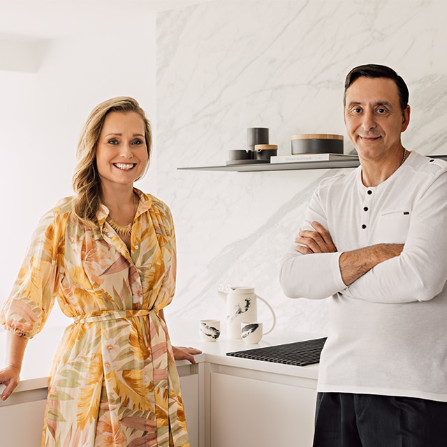
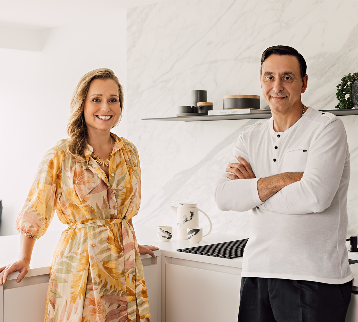
Kristine Paige + Karlo Arellano
It establishes the desired mood, creates an emotional background for furnishings and art, integrates the interiors with the surrounding landscape, highlights the details of woodwork—paint, as Kristine Paige tells it, plays a critical role in any design she creates. Perhaps it is little wonder that she and accomplished paint pro Karlo Arellano have formed a lasting partnership. “Kristine is the orchestrator using her skill set to wave progress along,” Karlo says. “But we know that a paint job can make or break that project, so we live by the phrase, ‘It’s not how you start, but how you finish,’ and bring the best product and application technique for each client.”
Learn more about Kristine Paige and Karlo Arellano.
“Color works best when it is developed into a thoughtful palette that unfolds throughout the project. Each hue acts as a team member to the others.”
— Kristine Paige
Kristine Paige’s favorite colors.


Faces of Design 2022
See the designers and painting contractors featured in the inaugural Faces of Design.

Designer Dialogue
Get more color and design tips from our Design P.O.V. contributors as we continue the conversation!
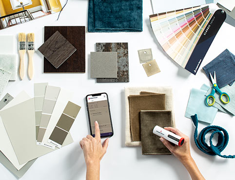
The Benjamin Moore Color Portfolio® App & ColorReader
Simplify color selection and eliminate guesswork.