The Elemental Color Palette
Evoking the Energy of Air, Earth, Fire and Water


The Elemental Color Palette
Evoking the Energy of Air, Earth, Fire and Water
Delve into wellness with interior design color schemes inspired by the elements—air, earth, fire, and water—and created in collaboration with Well-Designed.
When it comes to choosing the perfect paint color, we abide by one rule: Trust your instincts. Do you want a color that reflects your aura or your zodiac sign? Do you gravitate toward grounding, soothing colors or feel sparked by intense, fiery hues?No matter how you find the hues that speak to you, our elemental color palettes can help you set the tone and fill your space with energy and intention.
The Air Color Palette
The art and science of selecting airy tones.
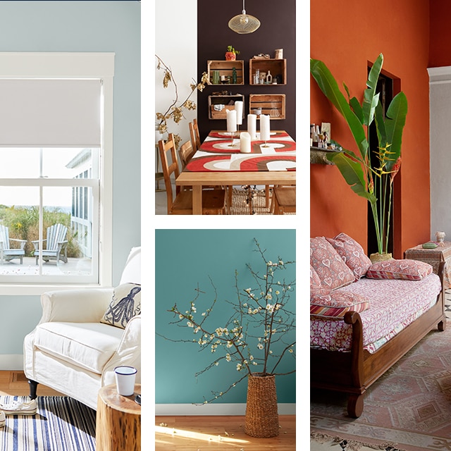
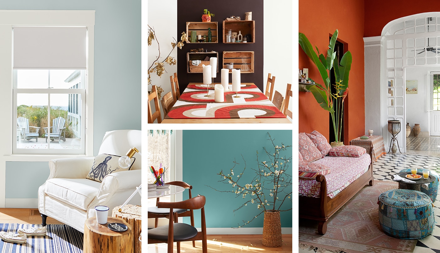
The colors of the air palette begin with the off-white Misty Air OC-44 and include the subtle beauty of pales and pastel tones, like Breath of Fresh Air 806 and First Light 2102-70, beloved hues that were both crowned Color of the Year in the past.
Representing a connection to the upper realms of knowledge and insight, air-inspired hues add perspective and understanding. In the psychology of color, or color theory, this clarity of vision—thanks to the free flow of air—allows us to control our thoughts in meditation, our words in communication, and our impeccability in how we approach life.
Use air tones in home offices, kitchens, or anywhere you want creativity and focus to flourish. For an especially airy look, use a blue like Ocean Air 2123-50 on an accent wall and add sheer drapery or wind chimes to draw attention to a soft breeze or other movements.
The Earth Color Palette
Grounding your space with earthly elemental hues.
To build our earth color palette, we connected with the planet and the rich hues found in soil and the ground. From the terracotta tones of Fresh Clay 2093-20 to the dusty Serengeti Sand 2164-40 and deep Rural Earth 1239, this palette moves from warm to cool and represents consistency, security, and being grounded.
Earth colors represent our collective past and combined wisdom. In connecting with history, we honor the teachings of the animal, mineral, and plant kingdoms and consider earth’s abundance.
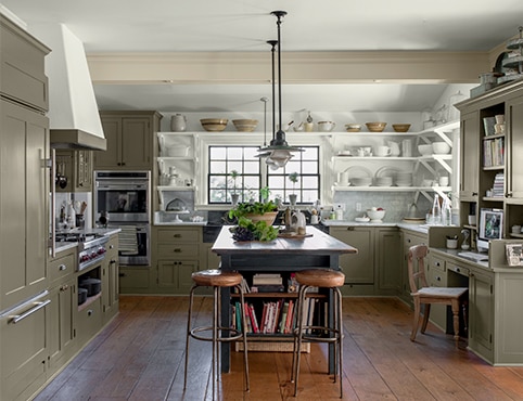
When drawing inspiration from our earth color palette in interior design, use different shades of brown paint colors to settle your entire space and bring the outdoors in. This monochromatic color scheme lends itself well to lively green accents and accessories from nature’s bounty—think foliage, stone, wood, and clay elements.
The Fire Color Palette
Igniting warmth with fiery reds and oranges.
Our fire color palette burns brightly, originating with red and moving through a dazzling tropical spectrum. Inspired by brilliant sunrises and sunsets, hues like Hot Tamale CSP-1155, Fireball Orange 2170-10, and Coral Spice 2170-40 come together to remind us that tomorrow offers yet another chance to manifest a new outlook.
Fire represents the opportunity for rebirth, creating a path for renewed vigor and positivity. In the warm glow of fiery jewel tones, we find a place to listen to our inner selves and find gratitude and peace.
Given the inherent liveliness of a fire color palette, use these hues in places where you want to add energy. Create a happy space for people to connect in living rooms, get creative with painted furniture, or extend a warm welcome with a brightly painted front door.
The Water Color Palette
Creating serenity with blues and greens.
From soft turquoise to vibrant teal, our water color palette features green and blue paint colors that soothe any space. Taking inspiration from coastal scenery and Mediterranean landscapes, these hues nurture and nourish, much like water does for us.
Essential for human existence, water feeds every life-form on the planet. A mirror of our emotions and well-being, marine-inspired hues like Azure Water 677 and Pool Blue 2052-50 help us to relax and reflect, especially at the end of the day.
Water tones are ideal for any space rooted in calmness, such as bedrooms, nurseries, kids’ rooms and bathrooms. For shared spaces, add to the theme with a water feature such as a fountain or aquarium.
Frequently Asked Questions
Q. What are elemental colors?
A. Elemental colors are hues inspired by the four elements: air (pales and pastels), earth (browns and neutrals), fire (reds and oranges), and water (blues and greens). Derived from ancient Greek philosophy, the elements can be seen in everything from zodiac signs to paint color palettes like ours.
Q. How do elemental colors affect our mood?
A. Everyone reacts differently to color—even those inspired by the elements. Whether buoyant or grounding, relaxing or invigorating, choose the elemental colors that have a positive effect on your mood.
For quiet spaces like meditation rooms and reading nooks, our air and water color palettes—featuring gentle pastels, blues, and teals—can help clear your mind. To inspire lively discussion and bursts of energy, turn to hues of the sunset, like the rich reds and oranges of the fire color palette.
Q. How can I use elemental color palettes in my home?
A. To use elemental color palettes in your home, take stock of the mood you’re trying to set. Once you’ve set your intention, go for a monochromatic color scheme and add accents inspired by the elements: fountains for water, greenery for earth, wind chimes for air, and candles or incandescent lighting for fire.
Q. What Benjamin Moore paint colors can I use to bring in the elements?
A. For calm and relaxation, look to the colors of the air and water palettes. We especially love Heaven 2118-70 and Pool Blue 2052-50.
To tap into nature and bring the outdoors in, look to earth colors like Toasted Chestnut 2174-10 and Wenge AF-180 to help you find a grounded, cerebral vibe.
If you’re looking to add vibrant energy, add a fire color like Orange 2011-10 or Hot Tamale CSP-1155.

Best-Selling Paint Colors
Use this collection of homeowner favorites to find the color that’s right for you.

Paint Color Samples
Test your paint colors from morning to evening, under both natural and artificial lighting conditions.


