For almost 20 years, Kristine Paige, of design firm Jackson Paige Interiors, has transformed both high-end residential and unique commercial projects into beautiful, inspiring spaces.
HQ: Los Angeles. Learn more at Jackson Paige Interiors and @jacksonpaigeinteriors.
Kristine Paige, Principal Designer and President of Jackson Paige Interiors, Inc., shares how she "explores the unexpected" with her clients, and reveals her own personal inspirations-think Basquiat and Coltrane.
How did Jackson Paige start?
Kristine: During my tenure at design school at UCLA, I was simultaneously managing a fine linen and furniture showroom. A cherished friend and close colleague, Sasha Jackson Premoli, was managing their sister showroom. We both found there was a void for clients looking for more comprehensive design services, so naturally we created our own firm, using our middle names as our title. Regretfully, we lost Sasha at 35 to cancer, but I would never dream to change the name. She is so much a part of the DNA of this firm and it is my honour to continue our partnership and her legacy through my work at Jackson Paige.
How would you describe your firm's aesthetic?
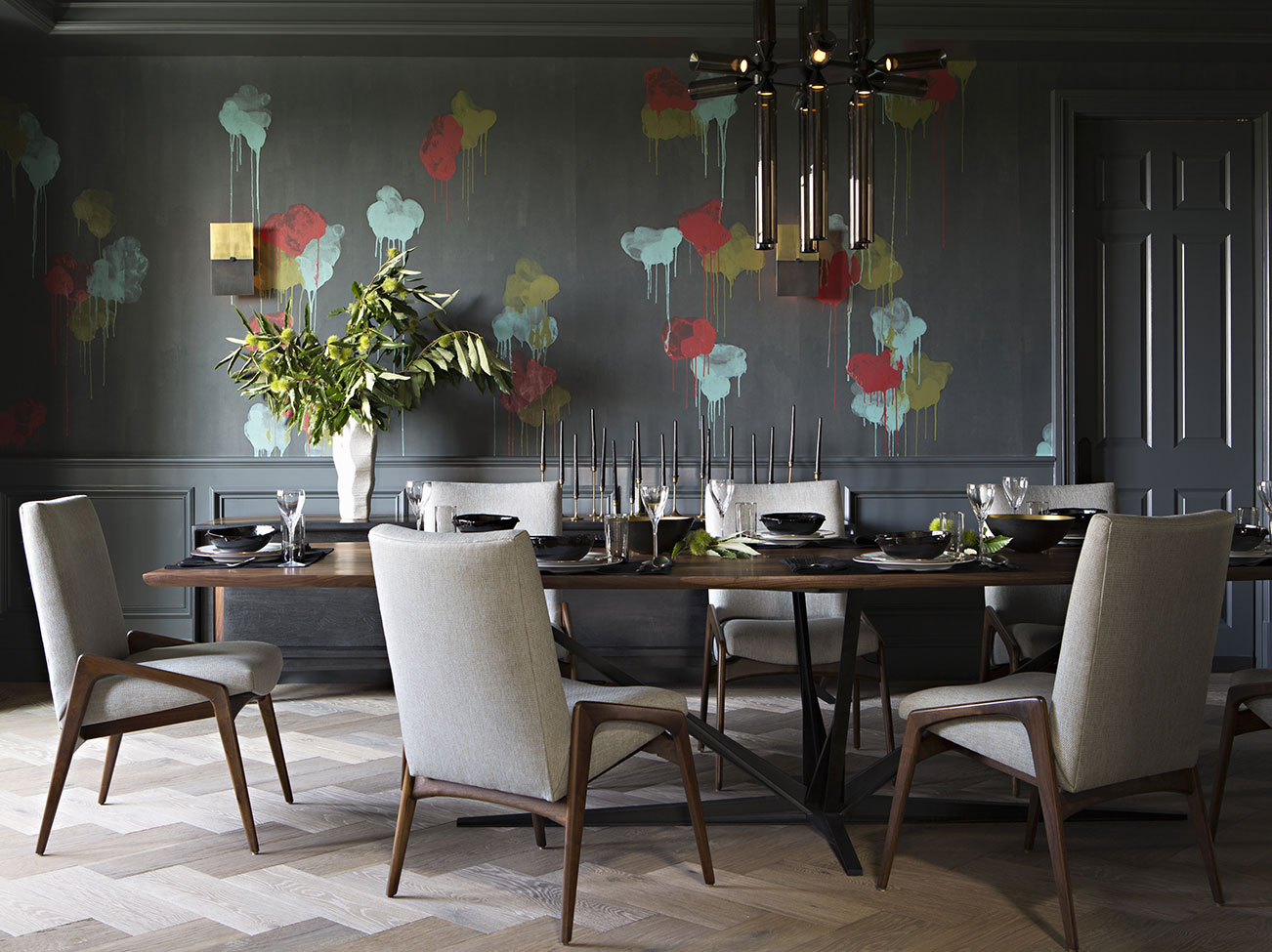
Kristine: Despite the fact we hail from Los Angeles CA, I wouldn't necessarily classify Jackson Paige as a "West Coast" design firm. We're definitely edgier and have a more global approach, with a bolder sensibility and flair. While LA is, and always will be, a strong influence, our firm offers sophisticated, classic designs but with a cutting-edge direction and twist.
My process typically begins with a neutral palette but infusing bold colour and dramatic statement pieces always provides the "wow." Texture and colour play a tremendous role in my designs; statement art and furniture pieces are infused into the mix for interest and fresh appeal.

How do you get to know your clients' style?
Kristine: We take into consideration everything and anything they send our way; from magazine tear sheets, outfits they love, Instagram save (or images) and Pinterest boards. Anything that provides insight into their personal taste. Visuals that speak to them can help us hone in on our client's style.
Tell us about guiding your clients to a winning outcome.
Kristine: I like to challenge people, but only to the edge of their comfort zone. If the process is not organic and authentic–I am not interested. At the end of the day a project has to reflect the client's tastes. We are always mindful of making sure they embrace our direction before we proceed or get too far down the road. Ultimately the project needs to suit their style; we want them to absolutely fall in love with their home.
Jackson Paige
Designer Showcase
See how Jackson Paige Interiors uses colour and art as striking accents against neutrals in this series of rooms and vignettes.
All of the photos in the Design P.O.V. series are courtesy of the interior designers featured. You can find paint colours like the ones pictured at
your local Benjamin Moore retailer.
Let's talk colour: How do you use deep, saturated dark hues?
Kristine: Deep, saturated hues work wonders in so many applications in a home. Rich, red dining rooms are dramatic and inviting at the same time. Red creates a warm relaxing atmosphere for conversation and dining. Powder rooms are another perfect venue to explore with colour placement; try a lighter wall with a dark contrasting moulding for a striking effect. We are lucky in sunny California to be able to infuse dark shades to balance our gorgeous natural light. Deep hues offer a powerful statement, it's a matter of balancing it with the appropriate lighting and juxtaposing it with lighter shades for balance.
"TEXTURE AND COLOUR PLAY A TREMENDOUS ROLE IN MY DESIGNS."
- Kristine Paige
Principal Designer and President of Jackson Paige Interiors
Do you have a favourite white?
Kristine: No question: White Dove is the fabulous go-to for my firm. Definitely. It's clean, soft and lovely; and works everywhere. For closets, Decorator's White is excellent. Clean and crisp. I also love Classic Gray, it's a variation of white with a soft undertone of delicate gray. Elegant and sophisticated.

Is there a way that you approach residential vis-à-vis commercial or retail?
Kristine: From an aesthetic point of view, there's no difference. We're still looking for that special magic to define the project and deliver on the client's expectations.
From a practical point of view, there's definitely a difference. While we are always geared towards great aesthetics, we are cognizant of both form and function on commercial projects, aware of code requirements and inspections we might not have on a residential project. And naturally, there are material specifications that will be different, driven by fire ratings and building codes that we research very carefully so we are in compliance.
What inspires your personal sense of creativity?
Kristine: Interestingly, I am more influenced by music and mood than visual influences. Rather than focusing on a specific design period, I like imagining what the soundtrack is from the movie featuring this property! Since our designs run the gamut and are inspired by many periods, I'd rather turn on Coltrane, Miles Davis or Bill Evans to get the creative juices flowing. Transport me to a place where I can let my mind go and I am off to the races.
How do you identify emerging styles or trends that you would want to incorporate into your work?
Kristine: I definitely use photography; I am constantly photographing anything that I find inspiring. At the studio, my team uploads everything in separate inspiration/trend folders. Lots of note-taking. I'm passionate about seeking new design sources. Often when I'm travelling, I select accessories, lighting and furniture and share them in our online boutique.
If you could have any piece of art in your life, what would it be?
Kristine: Hands down any work by Jean-Michel Basquiat. I am obsessed with one of his pieces at The Broad (a contemporary art museum in downtown L.A.). It's a provocative red and black canvas that is mesmerizing; untitled, I believe. Life is art!

Design P.O.V.
See video interviews, get advice, and find inspiration from leaders in interior design.

Order Paint Colour Sheets
Streamline and simplify paint specification with the help of Benjamin Moore Paint Colour Sheets.