Using Warm & Cool Paint Colours
Learn the basics about warm and cool paint colours, see favourite hues from our colour experts and homeowners alike, and learn how warm and cool colour choices influence your home’s style.
Every colour can be categorized as either a warm colour or a cool colour. Discover the notes and nuances of both, and use their distinct characteristics to get the look you want.
Favourite Warm Interior Paint Colours for Homeowners
Check out these gorgeous examples of warm paint colours we get asked about the most.
Favourite Cool Interior Paint Colours for Homeowners
We recommend these paint colours for homeowners looking for cool interior hues.
Using Warm & Cool Colours In Your Home: A Guide
Warm Colours
- Warm colours are typically used to create cozy and intimate spaces.
- Brighter warm colours are often associated with energy, playfulness and happiness including Million Dollar Red 2003-10, Orange Burst 2015-20, and Sundance 2022-50.
- Warm paint colours are popular in kitchens and living rooms.
- Warmer hues make larger spaces feel more inviting.
Cool Colours
- Cool colours contribute to a sleek, yet soothing vibe.
- Calm, relaxation and freshness are all attributes of cooler shades, including Ocean Air 2123-50, Winter Lake 2129-50, and Evening Dove 2128-30.
- Cool paint colours are popular in bathrooms and bedrooms.
- Cooler hues make smaller spaces feel more expansive.
Combining Warm and Cool Paint Colours?
Many homeowners use both warm and cool colours in the same room. The dominant colour—whether it is warm or cool—is the one that influences the room's personality the most.
Many homeowners use both warm and cool colours in the same room. The dominant colour—whether it is warm or cool—is the one that influences the room's personality the most.

Lighting is Always a Factor
Both natural and artificial lighting can affect how the undertones of a paint colour cast, causing them to lean more warm or cool. For rooms that receive a lot of natural light, the direction towards which the room faces should be taken into consideration.In rooms that do not receive a lot of natural light, artificial lighting will play a role in how the paint colour casts. Be sure to check your lightbulb temperature: Lightbulbs with a temperature over 3500K tend to cast cooler. The lower the temperature, the warmer and cozier the light it emits.
Brushing on a paint sample and observing it under all lighting conditions is the best way to ensure a “no surprises” paint colour choice."


Compare Warm and Cool Neutrals: Find the Undertones
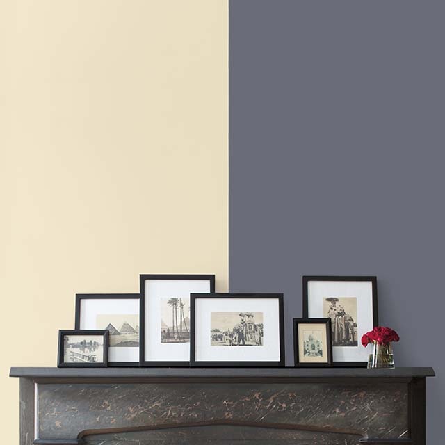
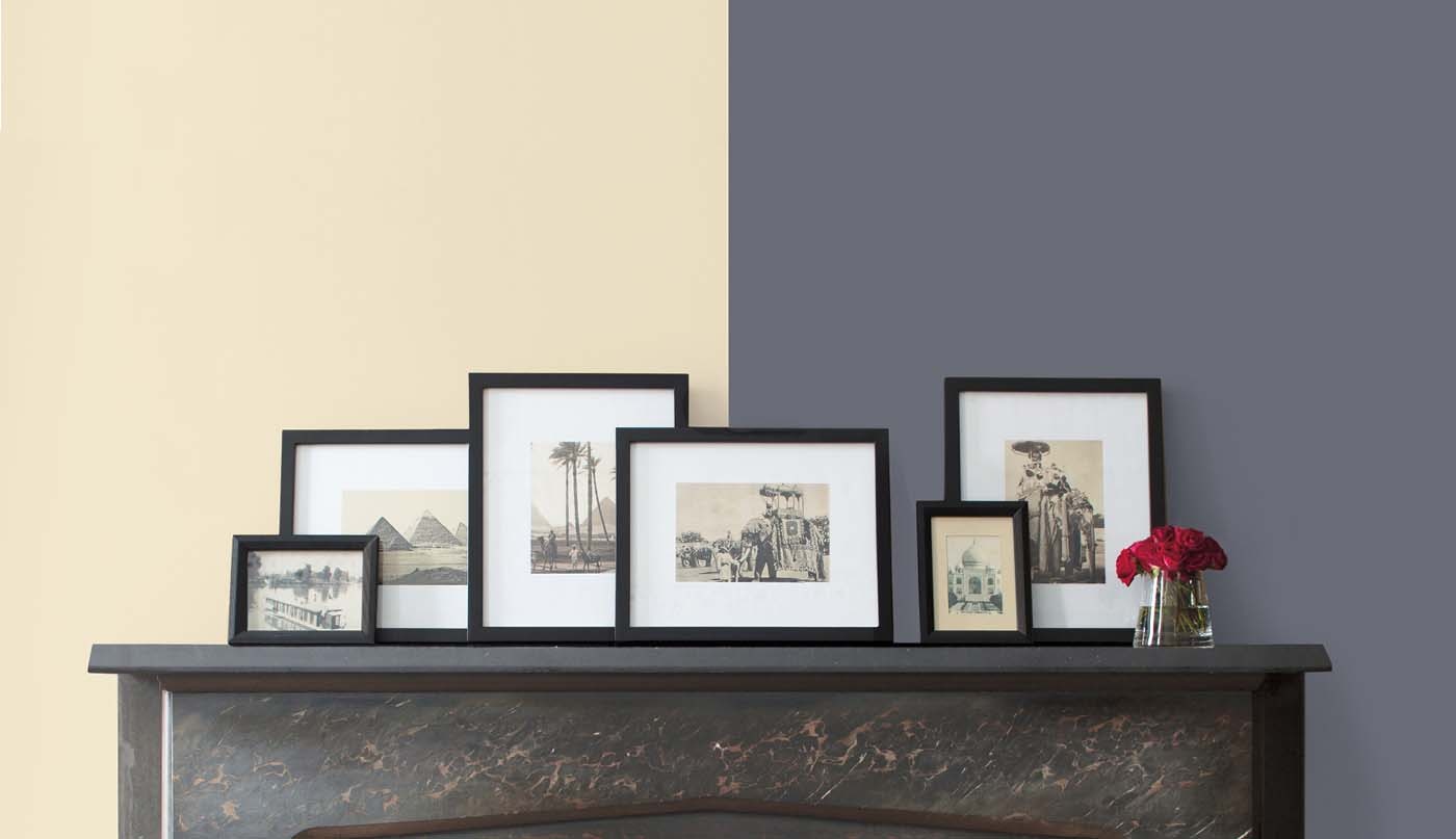
Identifying warm and cool white, gray and neutral paint colours is notoriously challenging. One easy trick when evaluating these hues is to compare them, as opposed to looking at any one colour in isolation.For example, when you place a white paint colour with a yellow undertone next to a white one with a blue undertone, the difference between warm and cool becomes instantly, and strikingly, evident!
Here, the soft back wall is painted in warm Ballet White OC-9, while the front wall is painted in cool Paper White OC-55.

Best White Trim for Warm and Cool Colours
White-painted trim is always classic and dependable. If you choose to paint your walls in a cool colour, Decorator’s White OC-149 offers a clean, bright look that pairs beautifully with blues, greens and purples.For warm-painted walls, White Dove OC-17 offers less contrast and a slightly more muted approach to white. It also pairs elegantly with reds, yellows and oranges.
If you have a mix of both warm and cool colours in a room, bright and clean Chantilly Lace OC-65 is a great white paint choice for trim.

Create a Complementary Colour Scheme
Two colours opposite one another on the colour wheel are considered complementary colours. In the simplest terms, they are red and green, purple and yellow, and blue and orange.The bold contrast found in complementary colour schemes makes any room stand out. Here, the muted green of Sharkskin 2139-30 on the wall creates design interest when paired with red chairs and a red-striped pillow.
Other complementary colour schemes include a deep purple wall in Shadow 2117-30, set off by soft, pale yellow curtains. Or a playful bright wall in Autumn Cover 2170-30, grounded by comfy chairs upholstered in a navy blue fabric.
Ready to play with complementary colour schemes? First, discern whether your wall’s paint colour is warm or cool. Then use the colour wheel on this page to see what its complementary colour is…and have fun!

How to Choose Interior Paint Colours
Learn from the experts on how to select colours you’ll love.
