Alternatives to Neutral Paint Colours
Alternatives to Neutral Paint Colours
Our palette of airy pastels, sunbaked neutrals, and dark natural paint colours is perfect for finding the balance between soft and bold. Expressly created to help neutral enthusiasts bring more colour to their spaces, consider these subtly saturated hues as a bridge from beige to beyond.
Lean on hues from this palette to bring a “progression of colour” into your home. Whether you are introducing a brand new colour scheme, or need something a touch softer in an already-expressive space, we’ve got you covered.Alternatives to Neutrals Colour Palette

Saturated Off-White Paint Colours
It might sound like a contradiction, but some off-white paint colours can provide a deeper colour than you expect. If you prefer white paint’s versatility and classic look, choose an off-white with strong undertones to get the best of both worlds. Here, the bright yellow and green undertones of Seahorse 2028-70 allows Chantilly Lace OC-65 to take centre stage on the doors and fireplace. The resulting look allows the minimalist décor and unique architectural details of this room to stand out.Other off-white paint colours with strong undertones include:
- Pink Damask OC-72, a soft white paint colour enhanced by a touch of blush.
- Mayonnaise OC-85, a versatile bright white with creamy yellow undertones.
- Minced Onion OC-128, a refreshing shade of white with an animated hint of green.

Tinted Neutrals & Pastels
Similar to saturated off-white hues, neutrals with strong undertones or pastels can be fun alternatives when you’re looking to add a soft pop of colour to your space. Pastels with warm undertones, like First Light 2102-70, a former Benjamin Moore Colour of the Year, and Windham Cream HC-6, flatter like a beige without reading too neutral.Deeper greige paint colours, like Pashmina AF-100 and Silver Fox 2108-50, offer a balance between light and dark while still providing flexibility for furniture, lighting and other décor choices.
If you’re looking for a cooler hue, opt for gentle hues with undertones of blue or violet. Silver Lining 2119-60 feels contemporary and fresh in this bedroom, buoyed by a modern four poster bed, lively print bedding, and other sleek accents.

Sunbaked, Earth Tone Colours
Like the earth baking in the sun, desaturated yellow, red, and orange paint colours can bring a touch of warmth to your space, reminiscent of clay pots and the easy elegance of Southwestern style.Here, golden Kurkuma AF-350 strikes a perfect balance between soft and dramatic, thanks to a brown undertone that lets it function as a bold neutral.
Other earthen, sunbaked hues we love include:
- Terra Bella AF-195, a compelling neutral enlivened by a vibrant orange undertone.
- Farm Fresh AF-360, a stylish tan that captures the perfect brown shade of an eggshell.
- Sienna Clay 104, a classic shade of terracotta with equal amounts of orange and brown.

Airy Blues & Greens
Reminiscent of the sky and the sea, many people already use blue, green, and blue-green paint colours interchangeably with neutrals. Cool colours have a natural tendency to recede, making spaces feel airier and more relaxing.When picking your perfect blue or green, consider the other hues in the room. In this kitchen, Yarmouth Blue HC-150 provides a light wash of colour against Swiss Coffee OC-45 cabinetry, drawing the eye up.
Looking for something different? Try one of these muted blue-greens instead:
- Ocean Air 2123-50, a go-to blue-green for creating instantly soothing spaces.
- Hollingsworth Green HC-141, a feather-light combination of green, blue and gray.
- Icy Morn 457, a light-blue green with a frosty gray cast.

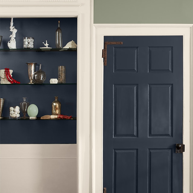
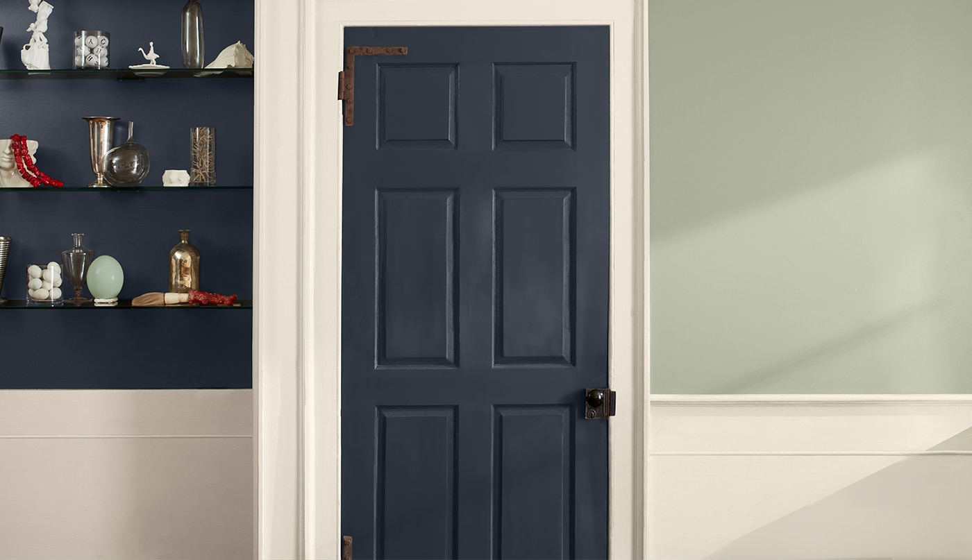
Dark Natural Paint Colours
Ready to fully immerse your home in colour? Try a darker hue inspired by the outdoors: forest greens, midnight blues, and even Galaxy 2117-20, an inky, blackened violet that evokes the mysterious expanse beyond. Perfect for a maximalist design style, deep hues rooted in nature offer a sense of being at one with the world around you.If you can’t decide if a darker hue is right for you, consult with the experts at your locally owned Benjamin Moore store or start with one or more colour samples. Whether you brush it on, tape it up, or try our Peel & Stick option, colour samples are the only way to get a true feel of how a colour will work in your space.
Frequently Asked Questions
Q. How can I slowly bring colour to my space?
A. Start small. Off-white, neutral or pastel paint colours with deep undertones can add some saturation to your space without committing to a bold colour.
Q. What paint colours can I paint my walls instead of gray?
A. To evoke the calmness of gray paint while using a different colour, invite in airiness and relaxation with cooler blues and greens like Crystalline AF-485, Sea Foam 2123-60, or Cumulus Cotton 2063-70.
If you find yourself needing additional colour resources, reach out to your locally owned Benjamin Moore store.
Q. What colours are similar to gray?
A. Combine the versatility of gray with the familiarity of beige with a “greige” paint colour. Many greige paints strike a balance between warm and cool tones, making it adaptable for most décor and design styles. For a bolder look, choose a greige with a deeper undertone.
No matter the colour you land on, make sure to sample it before you make your decision—it’s the easiest way to be confident in your colour selection.

Ideas & Inspiration
Turn any room in your home into an extraordinary space with vibrant hues and stunning colour combinations.

Colour Samples
Buy one or more colour samples to finalize your colour choice—and ensure peace of mind.