Creating luxurious comfort is effortless for art historian and historic preservationist Eric Cohler.
Eric Cohler discusses his distinct knack for "fusing" styles, shares why what a client doesn't love matters as much as knowing what they do, and reveals his favourite Benjamin Moore Colour Collection.HQ: Union Square, Manhattan. Learn more at Eric Cohler Design and @ericcohlerdesign.
Share some of the highlights from your home design process.
Eric: The first thing I do with a project is an intake session with the client—we sit down, talk about what they like, don’t like. From there I begin with a foundation—the rugs, carpet, flooring; the design momentum starts there. Then we select fabrics, textiles, furnishings and the colour—for me wall colour comes last.
Until I know exactly what’s going into a room, I don’t want the paint to dictate. I want the room to speak to the colour versus the colour speaking to the room. The wall colour is extremely important but comes at the end—like dessert, the best part of the meal.
How do you begin to understand your client and what they need?
Eric: We spend time with the client, visit their home, view the way they currently live. We explore the ways they may want to live. For example, I have a client that said she does not cook, but if we gave her a large kitchen, she will cook. And I said to her, “I'm not sure that really translates. You may have a beautiful kitchen, but I don't think you're going to start cooking, if you don't love cooking and if it's not a passion of yours.’ And she was like, "Oh, you're right." So we minimized the kitchen and created a larger living room.

Your living spaces are defined as luxurious—is living in the room compatible with creating a luxurious living space?
Eric: Luxury and living are not at odds. The greatest luxury is comfort and security and being with family. If I create that by putting cashmere on the walls, or install a deep tufted velvet sofa, something that is luxurious to the touch, to me that is the luxury aspect. The living comes from putting the family into the room.
"COLOUR ADDS DEPTH TO A ROOM."
- Eric Cohler,
Principal, Eric Cohler Design
What product collections have you designed?
Eric: Each of the products I've designed have been around my philosophy of putting living into a room. My lighting collection for Visual Comfort is inspired by American 20th century lighting and nature. The fireplaces I design for Chesneys underscore having a hearth for your home; ethanol fireplaces with a cartridge system are exceptional and very clean. My Lee Jofa fabric collection extends my desire for cosseting as I want people to feel their home is a safe haven that completely envelopes them in luxury. The Stark Carpets collection is key to my process of designing from the ground up—the rug is the base for me.
Do you have a preference in lighting?
Eric: With lighting I tend to mix it up—ceiling fixtures can visually lower the ceiling in a space without height, so no hanging fixtures on ceilings eight feet or under.
In a bedroom I prefer lamps next to the bed and not those on swing arms. And lighting control is a key element to change the space. If you turn a dimmer down slightly, the room changes; turn it up, the room changes again.
Eric Cohler
Designer Showcase
Luxury-meets-livable in Eric Cohler's interior design work. See how the art historian taps into a range of styles to create distinct interiors for his clients.
All of the photos in the Design P.O.V. series are courtesy of the interior designers featured. You can find paint colours like the ones pictured at
your local Benjamin Moore retailer.
Is there one area in the world where you feel the most at home, or that gives you the most inspiration when working there?
Eric: The city that most inspires me is London; there are so many layers to explore—many more than say in New York. My adventures there allow me to really look through all the various facets of the city—the past truly provides prologue for all creativity.
What is your view of other international design?
Eric: I love what the Swedes do with layering. They effortlessly layer Gustavian furniture with 20th and 21st century modernism. It all works together as though it was arranged accidentally—it flows. Americans have their own sense of style—traditional, but prepped up a bit.
Do you have a favourite white paint or colour?
Eric: My go-to white is Benjamin Moore's Super White OC-152. For me, it is a fail-safe ceiling colour. If I'm doing a lacquered room, I will use Super White in a high gloss sheen. However, for most ceilings I use flat paint since ceilings are never plumb. A flat sheen level will disguise imperfections.
Lately, I have been painting the baseboard and the doors the same colour as the walls as I want those elements to disappear.
One of my go-to colours is Hale Navy HC-154—for a blue room it never fails me. I also love the entire Benjamin Moore Williamsburg® Paint Colour Collection.

Tell us why you've been called the "original Mixmaster."
Eric: Almost two decades ago I was dubbed the Mixmaster by Traditional Home’s then editor-in-chief Ann Maine. I have an unusual ability to mix disparate objects together and making them look like they're part of a cohesive whole. For example, sometimes if you put an 18th century chair next to a 20th century commode, it doesn't look right, but I seem to be able to make it look natural and incredibly stylish.
The “secret” is my ability to create fusion. Analogous to fusion and foods, it's the way you mix the ingredients together and create a cohesive, delicious meal. I can't really explain my process because it's innate. It is likely a gift from my grandmother, who possessed a great sense of style and design.
Share some of the highlights from your home design process.
Eric: First of all, when designing a room, include more furniture and objects than necessary—and then edit mercilessly. I’d also advise to listen to your client carefully, but don’t make the “mistake” of including them as a member of the design team; try to keep their objectivity in place.
In my classes, I always start with an equation: POV=POV2. This is my formula for success. We all need to have a point of view. Diana Vreeland said that whether you have good taste or bad taste, it doesn’t really matter…as long as you have some kind of taste. The POV2 concept is the power of vision—which grows from your point of view. If I have a vision as a designer, and am able to translate it so the client understands it fully, I’ve done my job.

Design P.O.V.
See video interviews, get advice, and find inspiration from leaders in interior design.

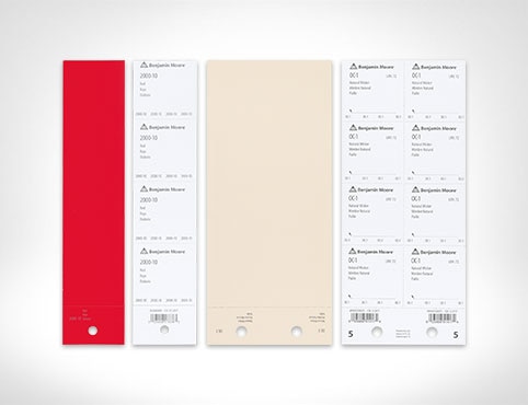
Order Paint Colour Sheets
Streamline and simplify paint specification with the help of Benjamin Moore Paint Colour Sheets.